
Dialogue Editor
Edit dialogue directly on a node or use the dedicated side panel for text, player options, background images and other details.
Overview
Dialogue nodes support quick edits on the canvas. The collapsible side panel provides dedicated fields for the full set of dialogue properties when you need more room or want to manage several options.
Key Features:
- Dedicated Text Editing: Large text area with multiline support for dialogue content
- Visual Image Selector: Browse and preview background images from your project's Content folder
- Option Management: Add, edit, reorder, and delete player response options with drag-and-drop
- Unsaved Changes Tracking: See what you've modified before applying changes
- Auto-Preserve State: Your edits are preserved when switching between nodes or files
Edit on the Canvas
With Edit Dialogue Nodes on Canvas enabled in Settings → Script Editor, click a Dialogue node's title, text, option or text block to edit it in place. Ctrl + Enter (or Cmd + Enter on macOS) finishes a text edit, Escape restores the text from before that edit and clicking away keeps the new text. You can also choose a character or work with tags from the node itself.
Turn off Edit Dialogue Nodes on Canvas if you prefer a read-only node and want to make all changes in the side panel.
Opening the Editor
Select a Dialogue node in the graph to open its details in the side panel. You can keep editing there while looking at the flow on the canvas.
Select a different Dialogue node to show its details in the panel. Selecting another node type closes the dialogue details and gives the canvas more room.
User Interface
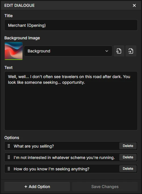
The Dialogue Editor is organized into four main sections, each handling a different aspect of your dialogue.
Title Field
The Title field is an optional text field that appears in the dialogue node header. It's primarily used for organization within the editor and is not displayed to players during playback.
- Optional: Can be left empty if not needed
- Display: Visible in the editor node header, but not shown to players during runtime
- Common uses: Speaker identification ("Narrator", "Alice"), scene labels ("Town Square - Morning"), conversation topics ("Quest Intro"), or any organizational text
Editor Organization
The Title field helps you organize and identify dialogue nodes at a glance when working with large conversation trees. For example, labeling a node "Captain Elena - Quest Start" makes it easy to find later.
Background Image
Add visual context to your dialogue with background images. Perfect for visual novels, illustrated stories, or creating atmosphere in your narrative.
Image Selection Features:
- Visual Browser: Browse all images from your project's Content folder with live previews
- Drag-and-Drop: Drag images directly from the Content Browser into the image selector
- Search Functionality: Filter images by filename to quickly find what you need
- Quick Actions:
- Show in Content Browser: Locate the selected image in your file tree
- Open File: View the image in your system's default image viewer
- Preview: See a thumbnail of the selected image directly in the editor
Supported Formats
The image selector displays all image files from your Content folder. Supported formats are PNG, JPEG/JPG, GIF, WebP and APNG. Animated images (GIF, WebP, APNG) play in the editor and in HTML exports, but game engines do not import them - use PNG or JPEG for projects that sync to Unreal Engine, Unity or Godot. Images are referenced by their relative path from the Content folder.
Drag-and-Drop Workflow:
- Navigate to your images folder in the Content Browser (e.g.,
Content/Images/) - Drag an image file from the Content Browser
- Drop it onto the image selector area in the Dialogue Editor
- The image is automatically selected and previewed
Text Area
The Text field contains the main dialogue content that players will read. This is the core of your narrative.
Features:
- Multiline Support: Press
Shift + Enterto create new lines within your dialogue - Large Editing Area: Expanded text area makes it easy to write and edit longer passages
- Real-time Display: Text appears in the dialogue box exactly as you type it
- Variable Interpolation: Use
{variableName}syntax to insert variable values dynamically - Spellcheck: Enable spellcheck in Settings to underline misspelled words in text fields (disabled by default)
Using Variables in Dialogue
You can insert variable values directly into your dialogue text using curly braces: {variableName}. This allows you to create dynamic, personalized dialogue.
Examples:
"Hello, {playerName}!"displays as "Hello, Alice!" if playerName = "Alice""You have {gold} coins."displays as "You have 150 coins." if gold = 150"Your health is {health}%."displays as "Your health is 75.5%." if health = 75.5
Note: If a local and global variable share the same name, the local variable takes precedence and will be used.
Options Management
The lower part of the Dialogue Editor is organized into three collapsible sections. Text and Options each have their own add button and support independent drag-and-drop reordering.
- Tags: Dialogue tags attached to this line, shown as removable chips. Click "Add tag" to open the project-wide tag picker (see Dialogue Tags).
- Text: The main dialogue text area plus additional text blocks. Click "Add Text Block" to create non-interactive display text.
- Options: Clickable button choices. Click "Add Option" to create a new button.
There is also a keybindable Add Dialogue Option command that inserts a new option and immediately focuses its text field so you can start typing. It ships unbound. Assign a chord in Settings → Keybindings. The command fires only while focus is inside the dialogue node's details panel.
Common Actions:
- Edit Text: Click on any item's text field to edit its label or content. You can use
{variableName}syntax to display variable values. - Multiline Text: Press
Shift + Enterto add line breaks within any text field. - Reorder: Drag and drop items within their section to change display order.
- Delete: Click the trash icon to remove an item. This cannot be undone.
Deleting Items
When you delete an option or a text block, any connections from its handles will also be deleted. Make sure to reconnect your story flow if needed.
Handles on the Node:
Items in the Text and Options sections create handles on the dialogue node in the graph:
- Text Blocks: Left condition handle (boolean) to show/hide the text block based on game state
- Options: Left condition handle (boolean) for visibility, and right "On Click" handle (execution) that fires when the player clicks the button
Tags create no handles. They are a data field on the node, read by the runtime when the line is entered.
Click-to-Advance
When a dialogue node has no button options (text blocks only, or no interactive content at all), a header output handle appears on the top right of the node. At runtime, players can click anywhere to advance, with an animated "Click to advance..." indicator at the bottom. This is ideal for narration or descriptive text that doesn't require player choices.
Input Elements Were Removed in v1.6.0
Earlier versions let you add interactive input fields (string, integer, float, boolean or enum) inside a dialogue node, under an "Elements" section. That section is gone.
Build inputs out of User Interface elements instead. Text Input, Checkbox, Dropdown and Slider bind to a variable in both directions, which is what those inputs were doing by hand. Progress displays a variable without writing it. Opening an older project clears the leftover elements and their wires in one pass, so no dead connections are left behind.
Dialogue Sections
Two kinds of dialogue content sit below the text area, each serving a different purpose.
Options (Buttons)
Options are clickable button choices that players select to advance the dialogue. They are the primary way to create branching narratives.
- Behavior: Player clicks to select, dialogue continues from the button's output handle
- Once Only: Enable the "Once" checkbox to hide the button after the player clicks it (see One-Time Options)
- Use Cases: Dialogue choices, branching paths, menu selections
Text Blocks
Text blocks display non-interactive text in the dialogue area alongside the options. They are read-only and cannot be clicked or interacted with by the player.
- Behavior: Displays styled text (no interaction)
- Condition Handle: Supports conditional visibility via boolean input
- No Output Handles: Text blocks have no execution or value outputs
- Variable Interpolation: Supports
{variableName}syntax for dynamic text - Click-to-Advance: Text blocks do not block the header output handle - dialogue nodes with only text blocks still show click-to-advance
- Use Cases: Additional narrative text, instructions, context-sensitive descriptions, conditional flavor text
When to Use Each Section
- Options: Standard dialogue choices with fixed outcomes (buttons)
- Text Blocks: Non-interactive display text (instructions, descriptions, conditional notes)
- Tags: Cues for the interface rather than for the player, so a line can trigger something on screen
Dialogue Tags
A dialogue tag is a plain name you attach to a line so your interface can react to it. Tags are never shown to the player. When the runtime enters a tagged dialogue node, it fires each of that node's tags in the order you authored them, and any On Dialogue Tag Reached node bound to that name runs its chain.
Typical uses are presentation cues: shake the dialogue box on an angry line, flash a portrait, play a screen effect or reveal a HUD element for one beat, all without wiring extra nodes into the story graph itself.
Adding a Tag to a Line
Tags live in their own collapsible Tags section at the top of the lower half of the Dialogue Editor. The tags already on the line appear as chips, each with an X to take it off this dialogue.
- Click Add tag to open the picker
- Type into the Filter or create... box to narrow the project's tag list as you type
- Use Arrow Up/Down to move through the rows, Enter to apply the highlighted one or Escape to close
- If what you typed does not match an existing tag, a Create tag "..." row appears at the bottom. Choosing it registers the tag project-wide and applies it in one step
The picker is backed by a project-wide registry, so every tag you have ever created is offered on every dialogue node in the project. Recently used tags sort to the top. Tags already on the current line still list at the bottom under On this dialogue, so you can rename or delete one without removing its chip first.
Tags Are Not Handles
Unlike options and text blocks, a tag adds nothing to the dialogue node in the graph. It is a field on the node, and the reaction is wired on the other side, in a User Interface file's script canvas.
Renaming & Deleting Tags
Each row in the picker has a pencil and a trash icon that appear on hover. Both act on the whole project, not just this line.
- Rename: Click the pencil to edit the name inline. Committing it rewrites the registry, every dialogue node carrying the tag and every On Dialogue Tag Reached node bound to it. Renaming onto another existing name is refused rather than silently merging the two, and the field outlines red while the draft would collide.
- Delete: Click the trash icon to remove the tag from the project. If it is still in use, a confirmation first lists the files that use it and states that deleting will strip the tag from those dialogues and delete its On Dialogue Tag Reached nodes along with their connections. An unused tag is removed straight away.
Tags are also indexed by Global Search, so searching for a tag name finds every line that carries it.
Reacting to a Tag
Reactions are authored on the script canvas of a User Interface file. Right-click the canvas, open the Tags section of the create-node menu and pick a tag to place an On Dialogue Tag Reached node bound to it. The node is an event entry point: it has an execution output and no input, and its chain runs each time a line carrying that tag is entered.
A graph can hold at most one On Dialogue Tag Reached node per tag, so a tag can never fire the same chain twice. A tag already used in the graph is hidden from the menu, and the node cannot be copied or duplicated. See UI Scripting for the rest of the canvas.
Audio
Dialogue nodes can play audio when displayed. This is perfect for voice lines, ambient sounds, or musical cues tied to specific dialogue.
Adding Audio to Dialogue
In the Dialogue Editor sidebar, you'll find the Audio section below the Background Image:
- Audio Selector: Click to choose an audio file (MP3 or WAV) from your project
- Loop Checkbox: Enable to repeat the audio continuously
- Preview Controls: Play/stop button with progress bar to preview audio in the editor
- Reset Checkbox: Enable to stop any playing audio when this dialogue displays
Audio Behavior
- Audio starts playing when the dialogue node is reached
- Non-looping audio plays once and stops
- Looping audio continues until stopped by another node or reset
- The Reset option stops any currently playing audio
Tip
For background music that should persist across multiple dialogues, use the Play Audio node instead. Dialogue audio is best for voice lines and sound effects tied to specific text.
Characters
Dialogue nodes can be associated with a character, displaying their name and portrait in the runtime.
Selecting a Character
In the Dialogue Editor sidebar, use the Character selector to choose from your project's character files (.sfc):
- Character Dropdown: Shows all available characters with their portraits
- Search: Type to filter characters by name
- None Option: Clear the character selection
When a character is selected, the runtime will display their name and portrait alongside the dialogue text.
Character Variable Interpolation
Use {Character.VariableName} to read a field on the dialogue's assigned speaker. To read another character, create a Character variable that selects its file and use that variable's name as the first part of the path.
Syntax: {Character.VariableName}
{Character.Name}- The assigned speaker's name{Character.Affection}- An Affection field on the assigned speaker{Merchant.ShopName}- A ShopName field on the character selected by a Character variable named Merchant{Player.Health}- Health on the character selected by a Character variable named Player
Nested Character and Data References
Dialogue, options and text blocks can follow a chain of Character and Data references. Start with a local or global reference variable, or Character for the assigned speaker. Each intermediate field must hold a single Character or Data reference, and the final field must be a displayable value such as text, a number, a boolean or an enum.
{Sword.Cost}- Sword is a Data variable selecting a weapon asset{Quest.RewardItem.Name}- Quest selects an asset whose RewardItem Data field selects another asset{Player.EquippedWeapon.Damage}- Player is a Character variable with an EquippedWeapon Data field{Character.Companion.Name}- Companion is a Character field on the assigned speaker
Paths read the current value, including inherited fields and changes made during play. Local variables take precedence over globals with the same name. Missing or incompatible paths remain visible as literal placeholders. Arrays, maps and bare asset references are not displayable final values; read a collection entry into a scalar variable first.
Field names inside paths are name-based, so check affected dialogue after renaming or deleting a field. Inserted string values are displayed literally: if a Greeting field contains Hello, {playerName}!, inserting that field does not expand the braces inside it. Put each placeholder directly in the dialogue text when it needs to resolve.
Variable Suggestion
When typing in the text area, press { to open the variable suggestion menu. Navigate with arrow keys and press Enter to insert. The menu includes regular variables and reachable Character and Data fields. You can also type a longer valid path directly.
One-Time Options
Button options can be marked as "one-time" so they disappear after being clicked. This is perfect for exploration-based narratives where you want players to exhaust dialogue choices.
Enabling One-Time
Each button option in the Dialogue Editor has a "Once" checkbox. When enabled:
- The option displays normally the first time
- After the player clicks it, the option is hidden on subsequent visits
- This state persists within the current story session
Use Cases:
- NPCs with multiple topics to discuss (each topic disappears after being covered)
- Investigation scenes where clues can only be examined once
- Tutorial prompts that shouldn't repeat
- Side conversations that shouldn't clutter the main dialogue
Unsaved Changes
The Dialogue Editor intelligently tracks your modifications and provides clear feedback about unsaved changes.
How It Works:
- Automatic Tracking: The editor compares your current edits against the saved node data
- Visual Indicator: An amber asterisk (*) appears in the dialogue node's header on the canvas, and a "Reset Changes" button appears in the Dialogue Editor when you have unsaved modifications
- State Preservation: Your edits are preserved when you switch to other nodes or files, allowing you to continue editing later
- Click to Revert: Click "Reset Changes" to discard your edits and restore the node to its saved state
When Unsaved Changes Are Cleared:
- When you click "Reset Changes"
- When you click "Save Changes" (because there are no unsaved changes anymore)
Tips & Tricks
Resizable Dialogue Nodes
Dialogue nodes can be resized by dragging their edges or corners on the canvas. Nodes automatically grow when you add options and shrink when you remove them, while respecting a dynamic minimum height based on content.
Auto-Label Buttons
Enable Auto-label Buttons in the canvas Settings menu (gear icon) to automatically fill button text when connecting to another dialogue node. The button's text will be set to the target node's title, speeding up dialogue tree creation.
Organizing Large Dialogues
- Write descriptive option text that clearly indicates the player's selection
- Keep individual dialogue nodes focused on one exchange or topic
- Use the Title field consistently (e.g., showing character names) for visual clarity
- Add Comment nodes to annotate complex dialogue trees
Image Workflow
- You can organize images in subfolders within Content (e.g.,
Content/Backgrounds/,Content/Characters/) - Consistent naming conventions can make searching easier (e.g.,
char_elena_happy.png) - You can drag and drop images directly from the Content Browser for quick selection
- The search field in the image selector lets you filter by filename when you have many images
Option Design
- Many developers use 2-4 options per dialogue node for readability
- Active and specific option text ("Search the ruins" compared to "Okay") can be clearer
- You can use conditional options (boolean variables) to reveal options based on player progress
- You can order options however you prefer based on your game's design
Next Steps
- Node Types Reference - Learn about all node types including Dialogue nodes
- Connections - Understand how to connect options to create branching narratives
- Content Browser - Manage your images and script files
- Variables - Use boolean variables to create conditional dialogue options
- UI Scripting - React to dialogue tags and build the input elements that replaced dialogue inputs